
Visualising your citizen science data
Learn more about the different ways you can present your data below.
Last updated 18 May 2026
Looking for a way to present your citizen science findings? Your collected data can be presented in different forms for easy viewing and understanding, such as charts, maps and infographics.
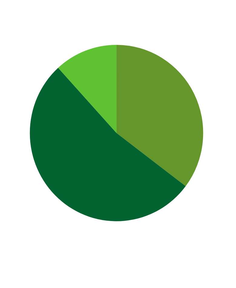
Pie Charts
A pie chart is useful in presenting the distribution of data by proportion.
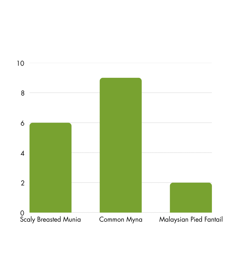
Bar Charts
A bar chart is useful in comparing numerical differences across groups.
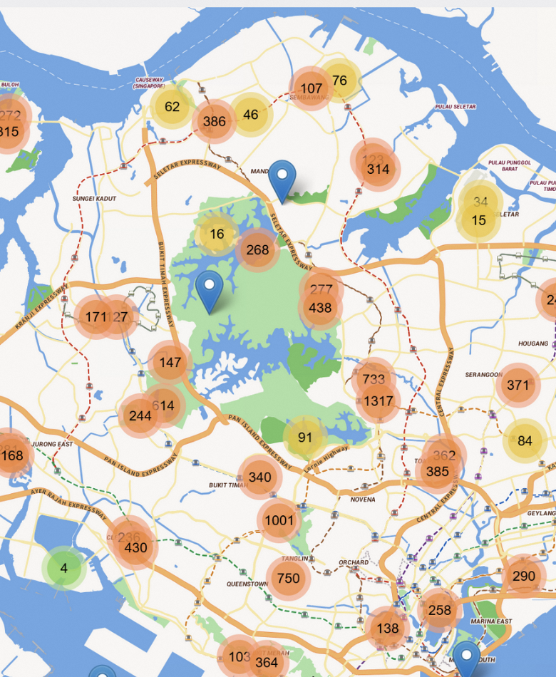
Maps
A map is useful in showing the geographical spread of sightings.
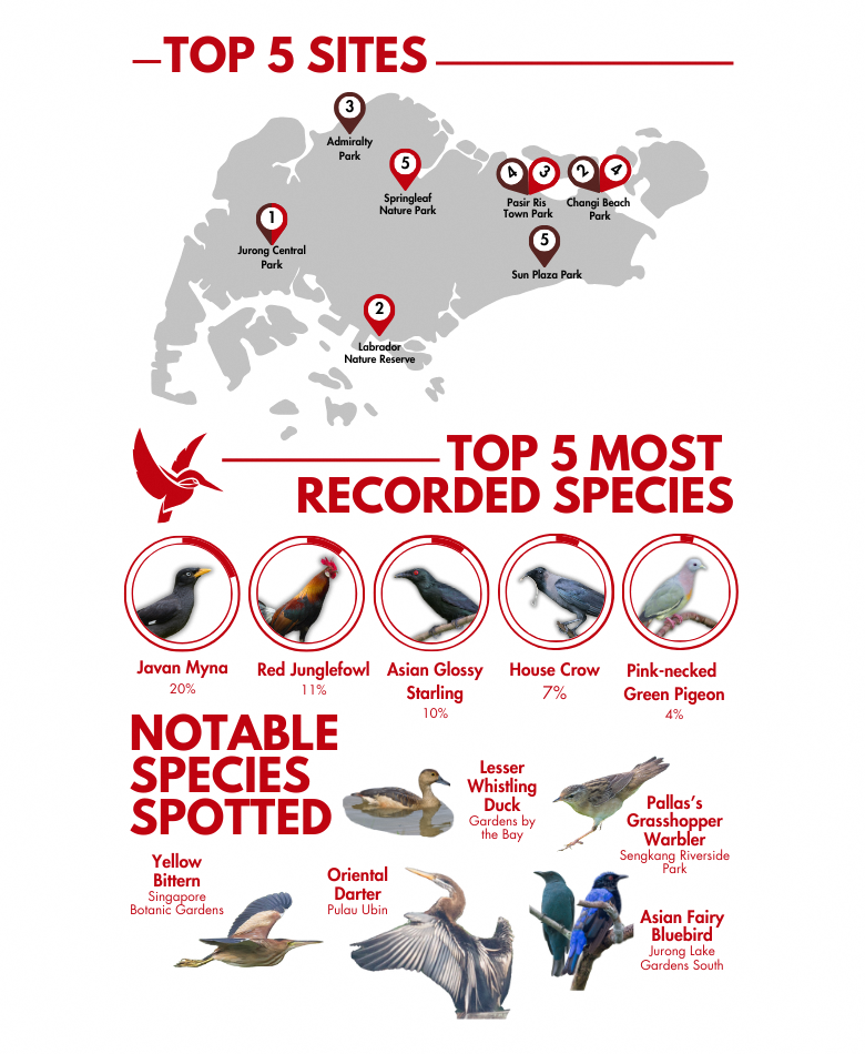
Infographics
Creating an infographic allows data and information to be understood and shared easily with individuals, communities and stakeholders.
Using more visuals, such as pictures, graphs and maps, makes the content more engaging.
Visualising your findings can help reinforce what you have learnt and you may even discover more about our native species!